
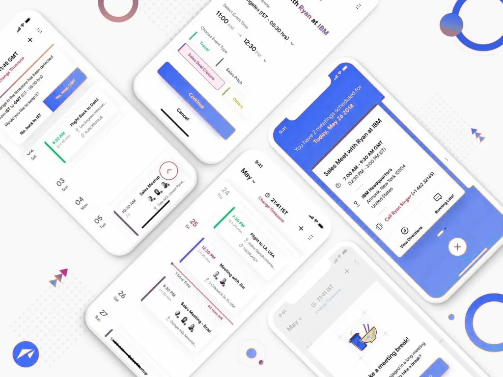
Figma wireframes and a component library on a designer's monitor

Designed on Evidence

UI/UX Design Studio in Denver, Colorado

Kemafy is a UI/UX design studio in Denver working on web and mobile products for companies across the US: user research, journey mapping, wireframes, Figma prototypes and interface systems. Every decision is tested with real users before it is built, and accessibility is designed in from the first screen rather than audited in at the end.

Products people can operate without a manual

When is UI/UX design worth paying for, and what does the work produce?

UI/UX design decides how a product behaves before engineering starts. It matters for anything people use repeatedly: SaaS dashboards, patient or customer portals, booking flows, marketplaces, fintech and healthcare apps. The output is research findings, journey maps, wireframes, a clickable Figma prototype, a component-based interface design and a handoff package for developers. Catching a broken flow in a prototype costs a day; catching it after launch costs a rebuild and retraining users.

Chapter by chapter

The long version.

The products that need a design phase, and the ones that do not

A brochure website for a plumbing company does not need user research; it needs good web design and a clear phone number. A product is different. If people will log into it every morning, book through it, buy through it, manage money or health records in it, the risky decisions are structural: which navigation model, how much to ask at signup, what happens when a payment fails, whether it works with a thumb on a small screen. Those decisions are cheap to change on a wireframe and painful to change in code. UI/UX design is the discipline of making them deliberately, with evidence, before engineering commits to them.

Designing for a phone in a parking lot

The first time most people meet your product is on a phone, between other things, often on an iPhone, sometimes with one hand. Our screens are laid out at 375 pixels first, flows can be abandoned and picked up later, returning users get shortcuts, and forms ask for the minimum. Accessibility is treated as a requirement, not a polish step: contrast, focus order, target sizes and screen-reader labels follow WCAG 2.2 and ADA expectations from the first wireframe. Where a step involves identity checks, a stored card or a consent form, we design the waiting, error and recovery states with the same care as the happy path, because those moments are where people quit. There is always a visible route to a human.

Inside a Kemafy design engagement

We begin with evidence rather than opinion: conversations with existing or prospective users, a review of support tickets and analytics, and a close look at the two or three competitors your buyers weigh you against. Journey maps follow, then wireframes in plain gray boxes that can be redrawn in minutes. Only when the structure is agreed do we open the visual layer in Figma, building a reusable component library instead of a folder of disconnected screens. The prototype then goes in front of real people with real tasks, and what trips them up is fixed before a developer writes a line.

The handoff package

You keep the Figma file, with edit access throughout the project rather than a PDF at the end. It holds every screen, the component library, color and type tokens developers can map straight into code, and a prototype that behaves like the finished product. Alongside it come the usability findings, a short record of why each flow was designed the way it was, and assets exported in the formats your stack needs. When Kemafy also builds the product, the handoff happens inside one team and nothing is lost between designer and engineer.

From first call to launch

How a project moves

  1. Learn

    Interviews with real users, a read of your support inbox and a teardown of the products your customers compare you with.

  2. Structure

    Journey maps and gray-box wireframes so navigation, screens and flows get argued about before any color is chosen.

  3. Design

    Screens built in Figma as a component system, assembled into a prototype you can tap through on a phone.

  4. Test and hand off

    Users attempt real tasks on the prototype, fixes go in, then developers receive specs, tokens and exported assets.

Baked in

Standard on every engagement

Research Before Pixels

Interviews, analytics and competitor teardowns shape the product before any screen is drawn.

Flows You Can Tap Through

Clickable Figma prototypes that let stakeholders and users try the product early.

Component-Based Interfaces

A reusable design system, not a pile of screens, so developers build once and reuse.

Validated With Real People

Usability sessions on the prototype catch confusion before it reaches production.

WCAG 2.2 From the Start

Contrast, focus order, target sizes and labels designed to ADA expectations.

A Clean Developer Handoff

Measurements, tokens and exports bundled so engineering never has to interpret a screenshot.

Rather talk it through?

Call or text +1 720 645 6094 and reach a Kemafy team member in Denver, not a switchboard. Weekdays, 9am to 6pm Mountain Time.

Handover

What lands in your inbox

  • Web & mobile product design
  • Component libraries & design systems
  • Clickable Figma prototypes
  • UX audits of existing products
  • Usability testing & findings
  • Developer handoff packages
Before you sign

Questions we hear on the first call.

What is the difference between UX design and web design?

Web design produces a marketing site people read. UX design produces a product people operate: it starts with research into how users think, maps their journeys, tests flows on prototypes and only then styles the interface. If your project has logins, dashboards, bookings or transactions, you need the second one.

Can we watch the design take shape?

Yes, and we prefer it. You get live access to the Figma file from day one, so feedback happens on the actual screens rather than on screenshots pasted into email.

How do you validate the design before we build?

Usability sessions: five to eight people from your target audience attempt real tasks on the prototype while we observe. Where they hesitate or fail, we redesign, then run the task again. The findings are handed over with the files.

Our app already exists and users complain. Do we start over?

Rarely. We audit the current product, watch where people get stuck and rank the fixes by impact. The highest-value screens get redesigned first and shipped in stages, so the product keeps running while it improves.

Do we own the Figma files and design system?

Completely. Ownership transfers to you in full, including the working Figma file, the component library and all exports, and nothing is revoked once the invoice is paid.

In their words

What clients say once the site is live.

Sales are up 50% since the new store went live. Checkout is three taps, and our regulars keep telling us how easy it is.
Cherry Creek BoutiqueE-commerce Development
01/09
Ready when you are

Put ui/ux design on the calendar.

Send a few lines about the business and the deadline. You get a written scope and a fixed quote back, usually inside one business day.